Presentation & Feedback 31/03/2017

Feedback:

  • Add captions to incorporate more detail about the models… like what they study/ interests, even if it’s in the image.
  • Add music over the moving image video.
  • The detailed shots with the cropping and different viewpoints are really interesting.
  • The layout composition works well.

IMG_1281.JPG

My Thoughts:

  • I am currently experimenting with captions and all the different ways they can be used. Having the captions will allow me tell their stories further.
  • I had thought using music over my video clips may have been distracting but having the option of using headphones will remove that worry. I will take the comment and try and use it when presenting my project, and will chose a song that links with at least one of my models. As some of the have a passion for music picking one of their favourite songs will be a nice touch.

Caption Artist Research

Tracey Moffatt- Scarred for Life

Tracey Moffatt was born in Brisbane, Australian in 1960. She is an artist who uses a lot of photography and video but has previously done art. She holds a degree in visual communications from the Queensland College of Art, graduating in 1982.

‘Scarred for life’ is a very deep and dramatic series of work, but is set in very mundane ways of life that happens every day around the world. Majority of the viewers recognise some of the events within the images as they’ve been through similar things or have witnessed and not understood. The words in her captions may grab the viewers’ attention but they don’t explain the images themselves, they do add some detail not enough to tell the full story. This may be a bit strange to some people as you’d think to look at the caption to get more context of what’s in the image and get a better understanding. This does allow the viewer to think more about the image and almost come up with their own story, based on the little information from the caption with the image itself. Moffatt has said that this series may be a continuing project as ‘everyone has a tragic tale to tell’.

I really like how basic the captions are and really reflect sourly on the image. It gives us a quick view into this person’s life without revealing their whole life, leaving the viewer wanting more. It’s a way of showing the little or big struggles everyone goes through. I may experiment with using basic captions for my images maybe stating a bit about them or what is happening. I want my viewers to see that we may all feel different but we all go through the same things, good or bad.

Jeffery Wolin- Pigeon Hill Portraits: Then and Now

Wolin now is a Professor of Photography at Indiana University but was born in New York, 1951. His photographs are in the permanent collections of numerous museums including the Metropolitan Museum of Art, New York; Los Angeles County Museum of Art; San Francisco Museum of Modern Art; New York Public Library; Bibliotèque Nationale de France, Paris; Museum of Modern Art, New York and more.

Pigeon Hill Portraits: Then and Now was photographed from 1987-1991, and included the people of Bloomington’s housing, in an area on the west side of Indiana known as “Pigeon Hill”. At this time there was a lot of discussion about politics, the problems with rising crime, drug abuse and also the enduring poverty. He had spent some years working as a police photographer and the experience inspired him to go to Bloomington and photograph some of the residents of Pigeon Hill, who had not seen the best walks of light. 20 years on he wanted to find out were those people had ended up and comparing the images.

During school Wolin had come across artists like Frida Kahlo and Sister Gertrude Morgan who had written directly onto their projects. He took inspiration and applied the same technique to his images, it was a way to connect the memories to the images. He says “Speaking about our memories is a creative process that changes and morphs all the time. That isn’t to say they aren’t truthful. Sometimes your memory becomes clearer after some time as well.”

I’m mainly looking at the captions he has created and I think it’s such a unique way of incorporating text. In a way it literally puts the story in the image. It really fits with his theme as he’s telling a story/ memory and the caption really helps bring context to the image, giving the viewer a deeper look into the models lives. If I were to add text I know this is something I would experiment with, trying different lengths of text, sizes and what I what the text to actually say. I haven’t really seen any other photographers who have used a technique like this when adding captions to their images. I think the way the text fits perfectly around the subject doesn’t distract from the image itself and in fact enhances it.

Duane Michals – Sequences & Talking Pictures

Duane Michals was born in 1932, Pennsylvania. He is known all over the world for his photographic inventions, especially his series working with multiple exposures and text. In the 1960s Michals made great creative progress within his photography career, which was heavily influenced by photojournalism. His handwritten text that he has one some of his images adds another dimension to the meaning, instead of being basic and normal. The past five decades, Michals’s work has been exhibited in the United States and abroad. He received a BA from the University of Denver in 1953 and worked as a graphic designer, until fell in love with photography during the late 1950s. He currently lives and works in New York City.

Michals has played many parts in many short film doing the roles of writing, directing and acting. This past experience inspired him deeply when creating new ideas within photography, basing the images on short films and creating a movie poster, in his style. He advertises each movie/ photograph with titles, credits and lists of actors, written in Michals’ handwriting to add a personal touch. To add to the over dramatic fiction movie theme he uses techniques like multiple exposure to convey the deep, emotional complexity of what he’s showing his audience. In ‘Are You Still A Faggot’ Michals plays a grandfather struggling to understand his grandson’s sexual identity. The images capture the conflicting emotions towards one another and having the texts adds to the harsh tone to the image and reflects the character discomfort.

First looking at the images you wouldn’t be able to really tell they were movie poster, but once looking at the text you can quickly tell. This style is unique to Michals which I good as if anyone saw a piece of his work without a name they would be able to tell it was his. I really like how the text is placed, also including the title within the image and smaller text. Giving a glimpse into the movie gives the viewer more of an in site to the images itself, allow the tile to do most of the talking. As Michals writes all of the text on the images it instantly makes them more personal, even if the story within is all fiction.

I’m going to take inspiration from Michals work when experimenting with different ways of using captions, also referring to his use of titles. His work shows that even if the text is handwritten it doesn’t have to be perfect and in line.

How Photographic Film Works

What does it really mean when you “take” a picture with a camera? When you click the shutter, you have frozen a moment in time by recording the visible light reflected from the objects in the camera’s field of view. In order to do that, the reflected light causes a chemical change to the photographic film inside the camera. The chemical record is very stable, and can be subsequently developed.

If you were to open a 35-mm cartridge of colour print film, you would find a long strip of plastic that has coatings on each side. The heart of the film is called the base, and it starts as a transparent plastic material (celluloid) that is 4 thousandths to 7 thousandths of an inch (0.025 mm) thick. The backside of the film (usually shiny) has various coatings that are important to the physical handling of the film in manufacture and in processing.

There may be 20 or more individual layers coated here that are collectively less than one thousandth of an inch thick. A very special binder that holds the imaging components together takes up the majority of this thickness. It is a marvellous, and ubiquitous material called gelatine. A specially purified version of edible gelatine is used for photography — yes, the same thing that makes Jell-O jiggly holds film together, and has done so for more than 100 years! Gelatine comes from animal hides and bones. Thus, there is an important link between a cow, a hamburger and a roll of film that you might not have appreciated.

Colour print paper is a high-quality paper that is specially made for this application. It is made waterproof by extruding plastic layers on both sides. The face side is then coated with light-sensitive silver-halide grains that are spectrally sensitized to red, green and blue light. Since the exposure conditions for a colour print paper are carefully controlled, the paper’s layer structure is much simpler than that of the colour negative film. Once again, gelatine plays a key part as the primary binder that holds the image-forming grains and the colour-forming components (couplers) together in very thin, individual layers on the paper surface.

Via http://electronics.howstuffworks.com/film.htm

Techniques

Film Images:

I’ve never used a  film camera before so espicially as this is my final major project I want to really push myself and try new tecniques. When previous working in the darkroom, using pinhole and photograms I really enjoyed it. As I’ve never worked with film I’m really intrested in how the images will come out and to develop them. Using a film camera means every shot counts, so I will take each shot with care and thought, hopefully getting a complely different image than what DSLR gives. When shooting with film I will most likey choose shoot with a group of people so I can get a wide range emotions from people and different view points/ angles.

Moving Image:

As I am moving onto Film Production next year I wanted to include some of it within my final major project. I plan on capturing part of the surroundings of my shoots as well as the actions of my models, I don’t want the clips to be stages too much as I want to their real emotions. I feel adding moving image will add to the rality of this projects as people will be able to see the models moving around, seeing almost a 360 degree of everything. Along with the editing there are so many way to showcase these moving images, but one thing I know is I don’t want to include any of the audio as I feel that may be distracting.

Captions/ Titles:

Captions and titles are a way to add some more context to the im,ages as they explain the story that little bit more. And I do want my viewers to get to know the models within my images, that’s part of what my project it, showing we all live different lives and even though we are different ages etc we all have some similaritys. I will explore all the different way of using captions and titles, from the way they are written to how I choose to place them on my images.

Different ways of using them-

  • Having the photographer write the text
  • Having the model wite the text
  • Informal/ formal
  • Basic infomation
  • Meaning behind the images
  • Explain what’s within the images
  • Placing the text ontop of the image
  • Leaving a gap to be written underneth
  • Text/ handwritten

Video Experiments

I wanted to add a moving image aspect as after this I plan on taking film. I also wanted to do it as it really brings something extra to the project, as you get get more of a feel for the life they live. I made sure include all different types of clips from many locations to show more of their life than we see in the images. It also feel very personal to me as I have taken all the videos and each of them hold a different memory. So in a way it’s an in site to my life as well as theirs, except I’m the one you never see in the pictures or videos but I’m involved in them all. In a way it’s kind of a behind the scenes of the shoots, as you see the models moving and also the location is moving too.

I really like how many ways there is to take it within the editing, having one clip after the other, using transactions, having layers or video’s next to one another. I may add some of my images to the moving image, overlaying it so both the video and image is shown, but I want to make sure I don’t overcrowd the screen so will have to choose carefully. When I have my final moving image sequence I plan on taking one of my models favourites, who’s hobby is music, and playing it in the background making it more personal.

Rafael Yaghobzadeh

JEUNESSE À FLEUR DE PEAU (ON EDGE) – FRANCE

Rafael Yaghobzadeh was born in Paris in 1991. His family were well travelled and were in journalistic circles. It was in 2002 when he found his love for photography and began covering what was happening in the news, from politics to fashion, for the ‘Sipa Press’. At this time he was still in school so he had to make sure to balance the two. As he evolved a strong interest in the economic and political issues that were surrounding him, he wanted to learn even more so began to study history in 2011. But he wanted to keep on covering the important events that carried on around him, still balancing both education and photography. Since then Yaghobzadeh has travelled to many places around the world that have been struggling under the bad economy and war, to document what life is like for these people. He has also collaborated with Associated Press, Le Monde, Paris Match, VSD, La Vie, Neon and more.

The work from Yaghobzadeh I’m looking at is called “Jeunesse à fleur de peau”, which roughly means how the youth these days are constantly on edge and something small could make them explode. It’s based around a group of 6 friends who live in eastern Paris, who have finished education and are starting their adult lives. The project has turned into a ‘personal essay’ to him, as he documented their personal lives throughout the day, documenting both moments of complicity and intimacy between friends, from 2010-2016

All of his images are in colour, as they’re all documentation of their life right now and everything they see in in colour. But a lot of his images are quite dark, either dimed by the night sky, low lighting indoors or covered by shade while outside. I think this is to show the comfort of keeping to neutral colours, having bright colours would maybe be shown if the group were of a younger age group. As they’re going into adult life they’re worried on what they’re going to make of their life and are scared to make the wrong decision. Most of his images have two or more people in them, showing the interactions that these youths have and showing how they spend their time. He makes sure to include interesting angles and viewpoints, when taking some of the images of the whole group he takes them as if he’s someone watching over them. I like this as in the shots will less people he includes some of the detail that is also around the models, making sure not to over fill the frame. In these shots he uses his aperture to make sure his models are in focus, and are the main point, while keeping the detail slightly blurred but still recognisable. Having a mixture of wide angle and cropped images is very important especially if there are many images taken over several years. He wants to keep the viewers engaged so to do that using different locations along with different viewpoints and other technical features. In some of his images he manages to capture some really interesting shapes within the objects that where around, from playground structures to the shadows from the trees. I feel like using these simple things and incorporating them into his images takes them up a level as they add extra texture and shape, when sat next to some of the more basic images it helps brings the whole project to life.

From the images you get a vibe that the models are living their life day by day, not really thinking about what’s to come, trying to make the most of their carefree youth. They’re making the most of the time they have with each other, even if they’re not doing anything exciting being in each other’s company is better than time alone. Within my project I want to capture the moments where my subjects are just enjoying having others around them, if it’s one person or five people. I want to capture their interactions, trying to document how differently they act/ look compared to when they’re going about their daily life alone. I’m not doing my project for as nearly as long as Yaghobzadeh but I still have a connection with all of my models as I’ve known them a long time. Hopefully this means my models will feel comfortable around me and my camera, acting as they would if I weren’t there documenting their lives.

Adam’s day

I followed my friend for this shoot, who is a uni student living in a small appartment in London. I made sure to include some of the detials within his room and also the walk he takes to get to uni, while stopping off to get a drink before.

I used a canon 600D to take my images with an 18-55mm lens. This whole shoot based around my friend Adam and what he does in his day-to-day life, living in London alone for uni. I first location that we shot in was in his room, as that’s where he spends most of his time. Even though he has white wall and quite a large window not much light got into the room as there was another building opposite the window. Even though some of the images are underexposed I didn’t worry too much as I knew they could be fixed easily with a bit of editing. I could have changed the ISO to a higher setting but that would reduce the quality and I would prefer to have better quality and have to edit a slight bit more, than have images with ‘noise’. As he is a TV student he spends a lot of his time on his laptop so I tried to find interesting ways to capturing him doing what he does most. I really like some of the angles I created and made sure to change my view point so the images weren’t all shot from eye level. I also tried to capture the little details within his room that allow the viewer to get to know Adam a bit more and what he’s like as a person, like looking at what was on his shelves and how have likes to organise them. Even though he doesn’t have too much in his room and there’s only white walls he have bright colours of yellow that really bring some like to the room and the images. We then went outside and I took images of him on his walk to uni and also in Costa. In some part of the walk the buildings shielded the sun from my model making the image underexposed slightly but as we went further the sun shun through. I tried to capture him a natural candid way, even though some of the images were staged. The views on the walk really helped to create such a big contrast between the images that were taken on my shoot with Veronica, as they incorporated more nature. Again I used different levels and angles to try my best to make the images as interesting as possible, as I found it quite had to make a walk interesting. I liked having Adam as a model as I felt he took direction well and wanted the images to come out as well I did, he was also quite natural even when having a camera following him around.

Throughout my shoot I tried to keep to a low ISO ranging from 100-400, but some of my images had to go a bit higher to ensure the images weren’t too under exposed. The two shutter speeds I used were 1/100s and 1/80s as they are both good settings that ensure little camera shake while still allowing a good amount of light through the lens. As my images had little to no moment the shutter speed didn’t need to be increased too much anyhow. With a few of the indoor shots I used a 1/60s shutter speed but there was no moments and little light so it was what was best to get the best images possible. As the lighting changed so did my aperture but this helped my images, as when outside my images used a rating of f/10- f/22 which meant more of my images would be in focus. This was good as I wanted the background of the river and skyline to be in focus as well as my model, while inside it was more focusing on the details so having an aperture of f/9- f/3.5 allowed us to focus on the main subjects in the image while having the background blurred.

I really like the outcome of this shoot as it captures what I set out to do, that was find out that Adam does in his day-to-day life, while looking at his personal belongings. I would have liked the exposer to have been better but I will edit them to how I feel will look best. If I were to re shoot around this location with Adam I would want to try include some of his uni friends just to see how he interacts with them compared to the other people I’m photographing. I feel like as he lives down the hall from his uni friends and goes out drinking with them it will be different to what he does with his friends he goes on days out with. I plan on doing another shoot following around another model but again in a different situation from Veronica and Adam, just so I can capture a wide contrast.


Grids

I wanted to put these images together as they’re all based on the same theme, of cooking. I like all the different view points and angles that i have captured within this collage. I feel all the images work as you can’t see the models face in any of the images which leaves some mystery of who this person really is, having to look at more images to find out.

I want to place with a lot of different layouts to find out which ones I like best, especially as the number of images in each collage will change. I want to make sure to have a good balance of cropped framed images and wide angles, just to make the overall image look interesting to the viewer as they layout can help make the images look even better. These images were based on being out and running errands, which isn’t very exciting. To make it more exciting I made sure to place different images with hints of colour that complemented one another.

I feel as if this layout is perfect for displaying images that contain details about the model but having one image that is maybe more important than the rest, like a portrait with the models face in the frame. Having the smaller details around will allow the portrait to stand out the most while giving the viewer more of an inside of who this person is and what they do with their private time.

When the selection of images are mostly wide angle I found it’s harder to get ascetically pleasing collage, but it can still be done. I found the tiles needed to be a bit bigger then they would be if the image was more cropped. Making the right template to suit the images is key, for example i prefer the collage to the left over the right as I feel we can see more of the images and get more of a relationship from the two models.

Lightroom 10

This is one of my favourite collages that I’ve created so far, as all the images tie nicely together because of the colour scheme. Having the two smaller images in the centre of the images is a nice touch of details that might have been looked over. I really like how the top image has the model more to her right of the image with her face showing, then the bottom image the model is more to the left and he face hidden. I feel this balances the image well, with a reflective aspect.

Having the images is a good way to have landscape images. As this was a basic layout I wanted to experiment with the spacing/ having no spacing. Depending on what images are used I feel the images can flow very well, creating a story leading into each other. With this vertical collage I wanted to include both of my models. The collage to the left having two different images of them with a detail of the store we were in to show the viewer how they were interested in music. The collage to the right includes one image of each of the models interested in the music at the top and bottom, while having an image of just their feet to show them together without revealing their faves.

Lightroom 012

I places these images together as they all are based on the model working at their desk. I made it interesting by creating different view points and angles, even though they are very similar as whats included in the frame they complement each other when placed in this grid as you get a view, almost like the viewer is there.

Lightroom 011

Within this grid I wanted to include some of the detail within the models life that is used or seen on a regular basis. I wanted the keys to show the one main thing he will always take them leaving the apartment, so maybe that is something overlook for it’s importance. Having the image of the beanies on the opposite corner allowed some balance as it’s quite similar to the picture of the keys, and is something the models uses a lot. I then had one image to show the views they see on their daily walk when leaving the apartment, as well as a cropped image to show relevance to the beanies while outside.

These two grids show two different takes to the models daily walk to uni and how they like to get a drink before getting the day really started. They both show the location in different ways as one included the London skyline and the other a street sign. The grids are very similar except one has space to show two portrait images and the other two landscape images. The left set allows one main image with two smaller ones to help tell the story, while the right showcased all the images more equal as they’re roughly the same size.

These three grids show more detail within the models life, as it gives the viewer more of an in site to what they’re interested in/ use on a daily. I feel using these images take it to a some what personal level as you can only see these personal belongings in their room. I tried to make every image in the grids relate to each other, like the middle grid includes items in the bathroom. Having a shot of the model larger just reminds the viewer who the person is and the smaller details show how treat themselves. The other two are quite similar, I was experimenting with different layouts and seeing what images worked well together. I feel the grid to the right is slightly better as it shows more of the objects that are used quite casually, for example reading or lighting a candle.

I feel these grids have more of an editorial vibe as they’re taken with different angles and different ways of cropping. I really like how there’s mainly white with small part of black and yellow, I feel it keeps the images very clean and brought together. They don’t tell us too much about the model as a person but all of these images together make a strong grid.
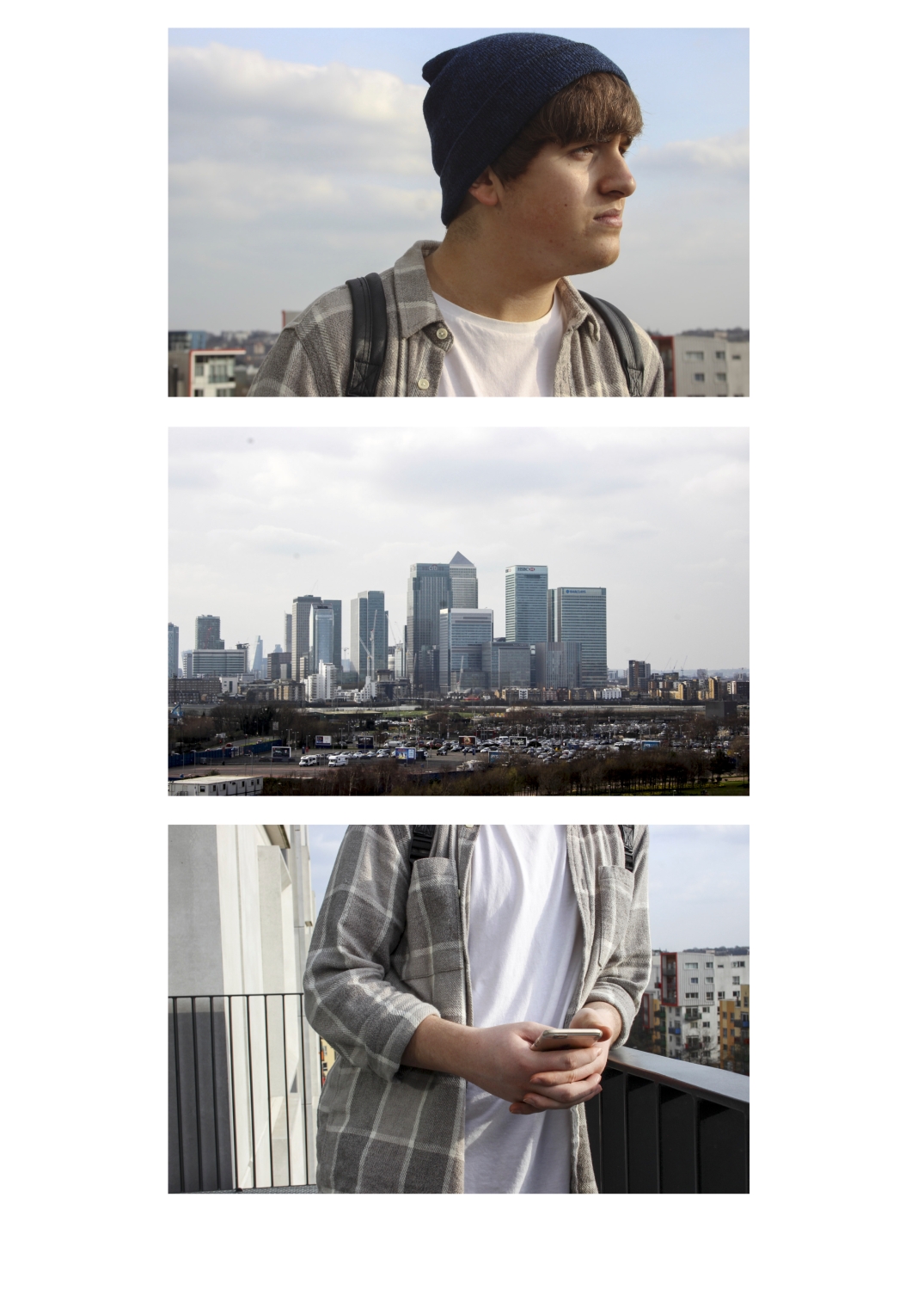
Lightroom 001

This grid shows us where the model is living, giving us more detail about them. I just liked how these images sat together as they have the same colour scheme as well as all linking. As the model is looking at the distance, having the view shown and then having the bottom image placed like that makes it more unique and interesting.

These grids show the model in the park. I wanted to include the caring image of the model with the dog as well as the cropped image of her feet, to include wide angles and cropped. The other spaces I wanted to bring in the models connection with her phone as well as her sense of adventure, roaming around in nature. Both of the top images are quite open which I like as a lot of the bottom images are cropped filling up most of the frame. They just allow more scenery into the grids, opening them up more.

For this grid I experimented with two themes, one focusing on the model doing her colouring to relax and the other being a more overall look at what she does within her room. I really like the colouring of one as it has many different angles, showing the concentration on her face as well as the detailed hand movements. The more over view look of the models day allows us to see more of her life with less of the attention to detail.

Lightroom 0013.jpg

What I like about this simple one is how the intimate interactions between the two models, showing the viewers their connection. That is shown more within the phone sharing image, I wanted to place the smiling image next to it as I wanted to show their facial expressions. The smile show a relaxed feel to the grid, inviting us into their friendship in a way.

Lightroom 0015.jpg

Within this grid I wanted to include the interactions between the models as well capturing them carefully looking for their favourite records. Doing this allowed a balance within the images having each diagonal image either be them alone or together.

Lightroom 0020.jpg

I liked having three different aspects within this grid as it has an image of just the surroundings, a unique image of 3/4 of the models where you can’t see their faces and an image of one of their faces in the location. The colourings really flow well together, allowing the images to all look in the right place.

Lightroom 0026.jpg

I wanted to have a grid of my model in her car as it’s not something the rest of my subjects have access to. I like how calm and carefree she looks driving considering how young she is. Capturing different view points within the car it’s almost like the viewer was in the car with the model too, inviting the audience in.

Lightroom 0029.jpg

A lot of the models room was white/ grey so to add some colour to the grids I included other details within it, these details also gave the audience more of a story of who this girl really is.
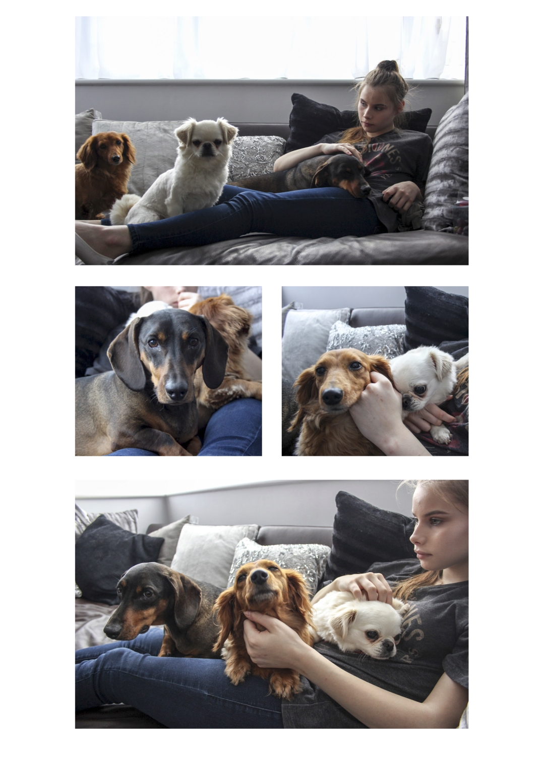
Lightroom 0033.jpg

I really like this grid as even though the model looks quite cold she sees her pets everyday and you can tell this by the way the dogs are in the images. They all are quite relaxed, even posing for the picture in some cases. This is good as it’s like taking a portrait of the dogs as well, showing what they’re like too.
Noelle Swan Gilbert

Based in Los Angeles, Gilbert is a fine art and documentary photographer who likes to also incorporate moving images alongside her still images when showing her visual stories. In 2007 her sister was murdered, leaving a grave loss in the family. She did a project ‘Life After Death: How Murder Affects A Family’ documenting the lives of the children who’d lost their mother. This project opened Los Gilbert’s eyes to how precious each moment we have is and never to take that for granted which inspired her to do a project on her own children, ‘Right Now, This Is The Way It Is’. Her work has had a lot of recognition as she was a Critical Mass finalist in 2010 and in 2011 she was nominated for the Santa Fe Prize in Photography for Right Now. Noelle is a founding member of SIX SHOOTERS, a group of six female photographers engaged in a daily photographic dialogue, as well as the copy editor and a staff photographer for Lenscratch, a daily journal that explores contemporary photography.

‘Right Now, This Is The Way It Is’, a fine art series documenting insignificant yet moving moments in a teenager’s lives. It gives us an inside to the world that her daughters and their friends live in, capturing a range of emotion. She feels these everyday moments in each of their lives to be just as important as the next, taking nothing for granted. She wants to capture the moment and all the emotions within before it’s gone as she believes ‘it’s a world where black and white dreams turn into colour and it only happens once.’ This is the only world she knows and capturing it and sharing it with others who have a completely different world is important to her, especially if it can inspire others to never take their moments for granted.

As she is documenting the modern world it’s appropriate that here images are in colour, bringing the bright youth to shine through. I really like how the colours complement each other in an image, she has made sure there were no clashing colours or colours that stood out over the rest, distracting the image. She is always making sure to change her view point, cropping and angles to make every image unique. I feel this makes the series even stronger as it makes every image interesting, having her subject in the centre of the fame in one image then incorporating the rule of thirds shows she’s really thought about every shot. I do like how some of the images are wide angle setting a whole scene through a distanced shot and other images have the framed filled with one or two items but the image is still able to set the scene just like the wide shot, just in a different way. Having all the images cropped as squares helps unify her project, where she has so many different locations and subjects having that same crop can help tell the story in a way that we can understand. She uses the day light a lot to light her images which I feel is the best when taking documentary images as you don’t want them to look staged, all her images are all taken in the moment, allowing them to be real and free. In some of the images that have one main focus she uses a low aperture so the subject will be the main focus. She also makes sure that in the wider shots she makes sure the image is all in focus, using a higher aperture. Looking at her whole series you get a playful happy feeling from it, which is what he wanted to portae.

What I love about this series is how true it is, as everyone was kid ones so can relate to the joyous moments Gilbert has captured. She makes a point to make every image different than the last by changing the angles, depth of field and framing which I love. Even though every image is different she still manages to unify the whole series but allowing all the colours with their saturations to flow together nicely that combined with the square crop and carefree teenage sprit pulls everything together well. Her images make me, as the viewer, to go out and enjoy life while I still can, appreciating every moment, which is such a powerful notion. Within my images I want to capture the life of my teenage friends in a way that will give inside to how everyone lives a different life but we can all come together and enjoy it. I want to tell my viewers, through my images, to appreciative the life that they have with the people who mean a lot to them, as well as making sure we keep some time to ourselves to reflect and rebuild.

Anne-Stine Johnsbråten – East side to West side Youth Culture in Oslo

Johnsbråten, born in 1983 on the eastern part of Oslo, is an independent documentary photographer. Her main style of work includes combining reporting stories with portrait images to explore topics like gender, identity and discrimination. She spends a long time on each of her projects to really connect with the story and the people involved, allowing her images have a real meaning. Some of these long-term projects have been exhibited in galleries and festivals in Norway and abroad, not just getting her name out there but the message within the images as well. She has covered subjects from her family to how the workers in Bangladesh are treated.

Her work of the ‘East side – West side – Youth Culture in Oslo’ is a series of hers that has inspired me. In Oslo August 1624, there was a huge fire that destroyed the city. When it came to the rebuilding of the city King Christian IV said it would be near Akershus Castle Fortress. He also decided that it would be best to split the rich and the poor into different areas on opposite sides of the city. This divide had the rich community in the West Side and the poor working class in the East Side. As the years went on the divide become more and more present. Within her work Johnsbråten tells this story through two groups of teen girls from opposite sides of the city, questioning how different the two are brought up, how people deal with the split and are the people really that different.

East Side-

West Side-

All of her images are in colour as she’s documenting the lives of teenage girls and if she were to edit the images into black and white it would take some of the story away. In some of her images there is a colour or two that does brighten up the image, allowing the life of the image be brought out. You can tell she thinks a lot about the composition of her images, as all the subjects in her images are places perfectly in the frame. There isn’t an image were she has framed her subject in the centre of the frame, incorporating the use of rule of thirds. I feel by doing this it allows us at the viewer to look at the setting/ location of the image that really sets the scene. The majority of her images have a wide angle, including the whole body of the subject, not really honing in the details. It’s like she’s a fly on the wall in the way she is using different angles, levels and viewpoints that really makes the images interesting. A lot of her images are taken using daylight; this allows the images to be lit well without crating harsh shadows or an orange glow. For the images that use artificial light you can tell she has paid close attention to the while balance and where the light is that is actually lighting the frame. I feel she uses a low aperture as this allows the shot to be lit better but creates a depth of filed but this doesn’t affect her images at she is focusing on how her subjects live their lives. The editing quite light and natural as with documentary you don’t want to take away from the focus of the models.

I love how she has really captured the contrast of the more privileged West side compared to the more second-class East siders. You can clearly tell they have been brought up in a different way, but at the end of the day they’re all teenagers who want to have fun while they still can. I really like the casual approach she took to this project, really capturing the true spirits of the subjects. Even though Johnsbråten is from the Eastside she is still objective while taking the images. I like how she’s captured a lot of fun and real emotions, shedding light on how the other side live. Once I knew the context behind the images I loved the series even more, as it was telling an on going story of two sides of the same country were divided, showing us the differences and the similarities. While taking my images I will think about Johnsbråten and how she was documenting how different people of the same age live and I want to take that thought and put my own twist on it.